Rose Jade Handcrafts — a creative duo and sister team — came to me seeking a brand identity that authentically reflected their shared aesthetic vision. Their directive was deceptively simple: craft something clean, timeless, and instantly memorable.
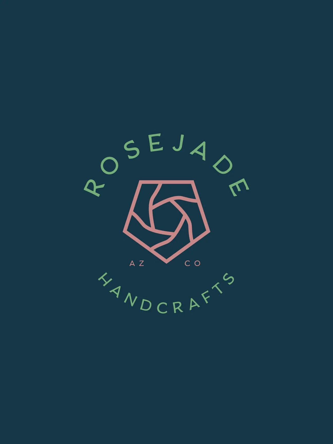
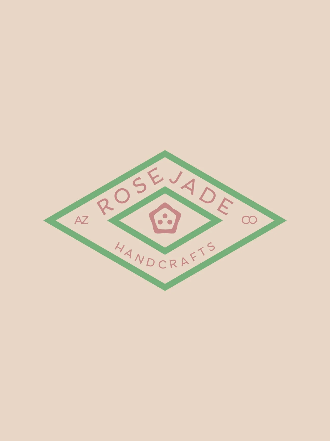
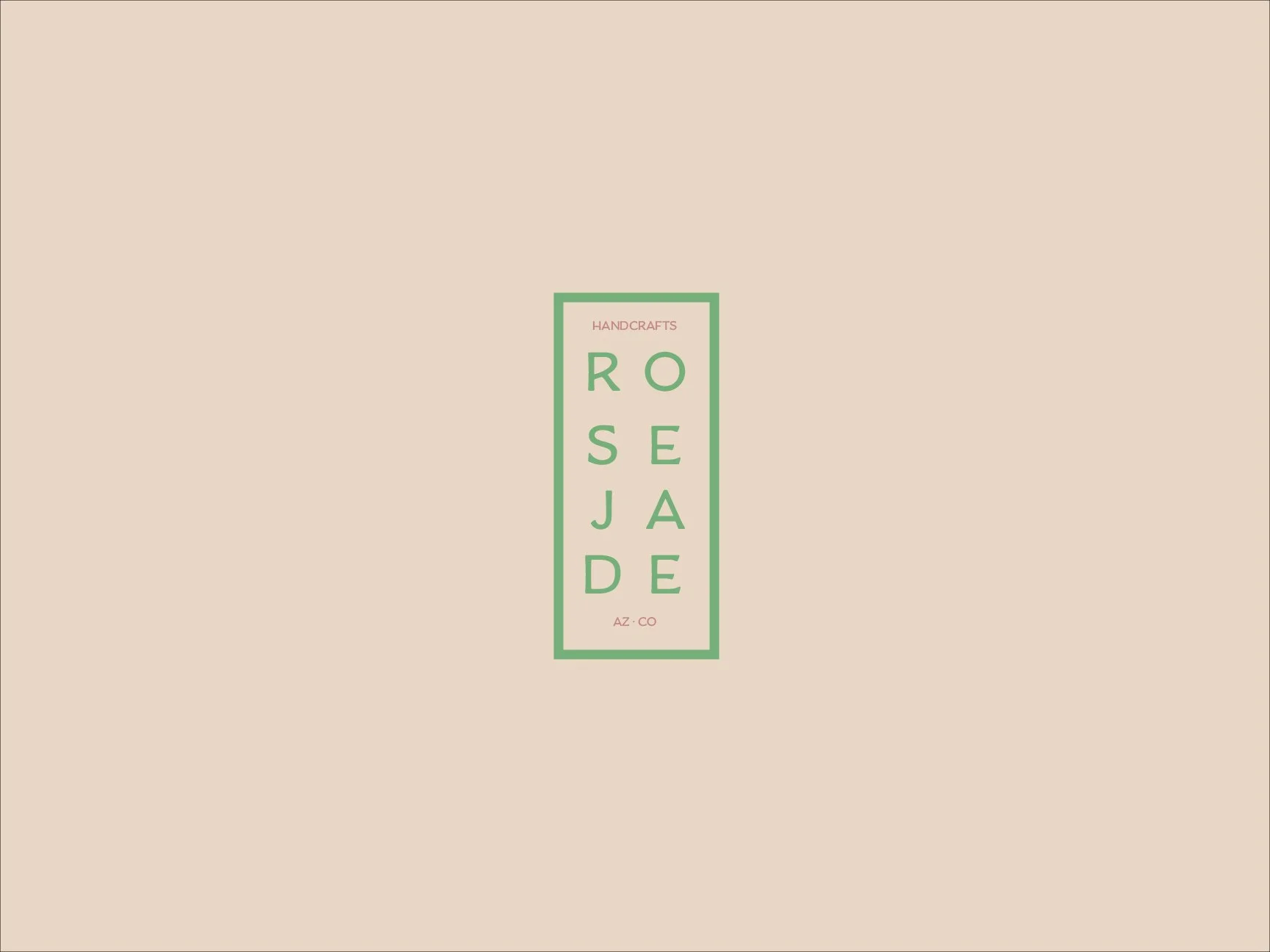
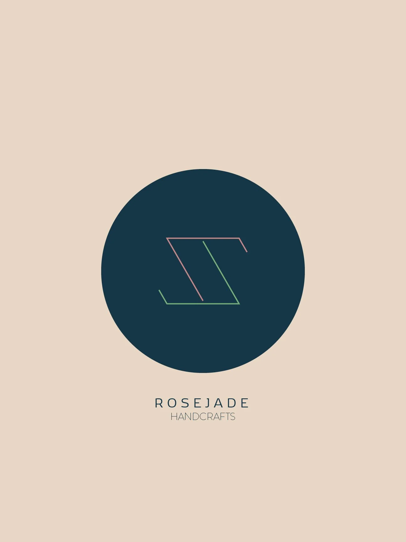
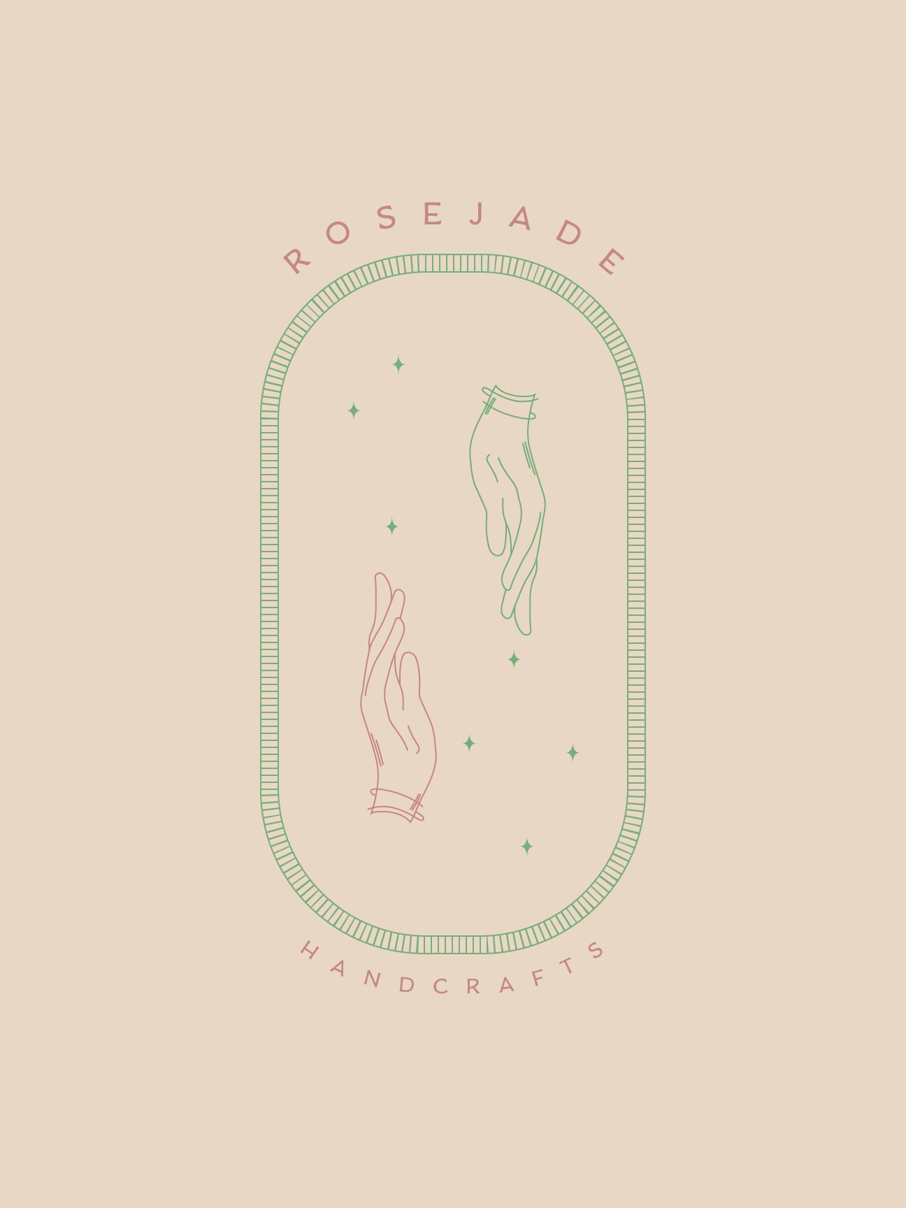
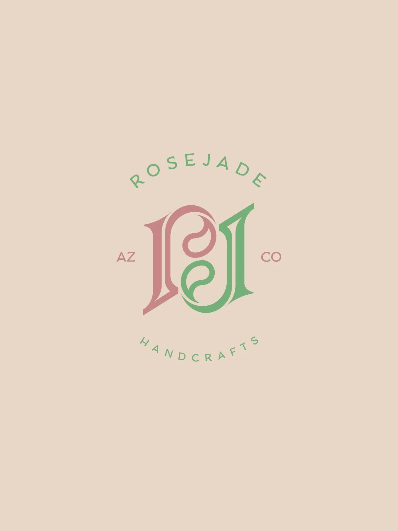
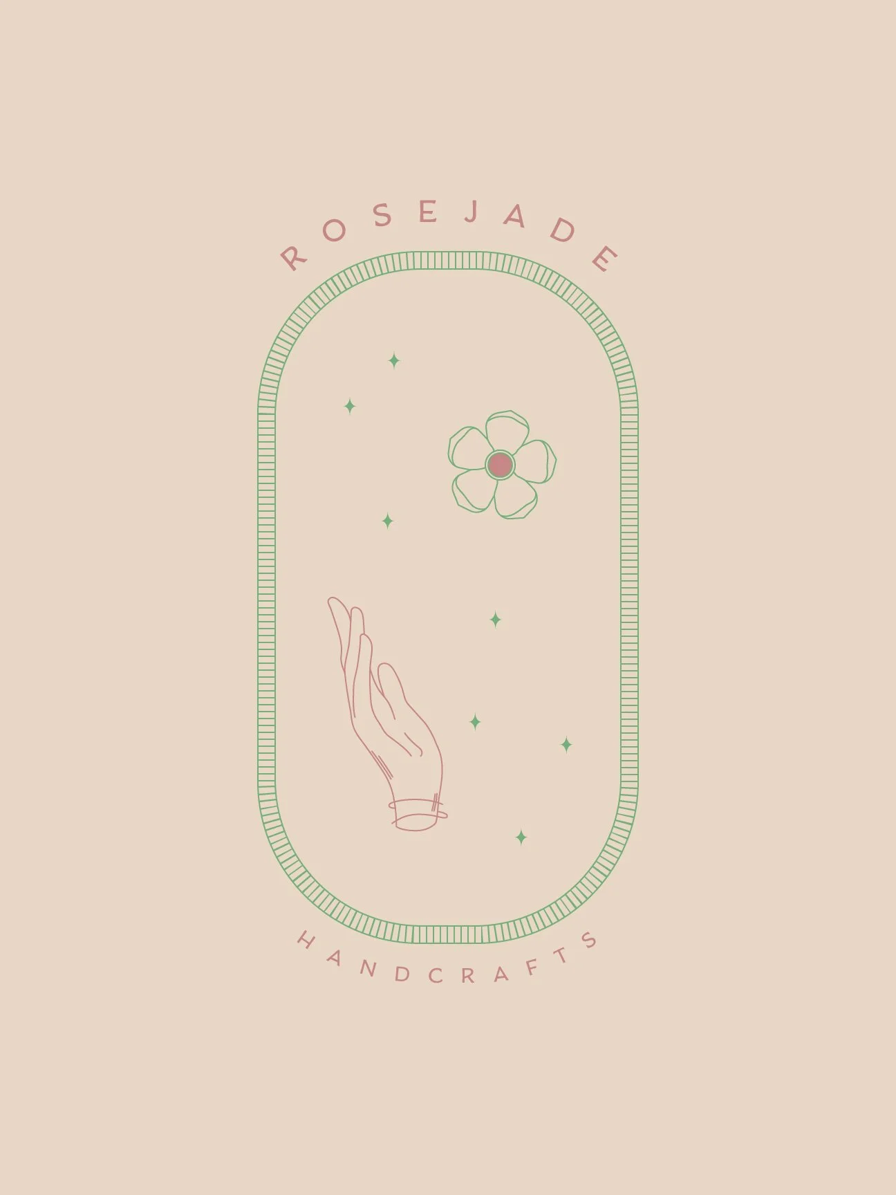
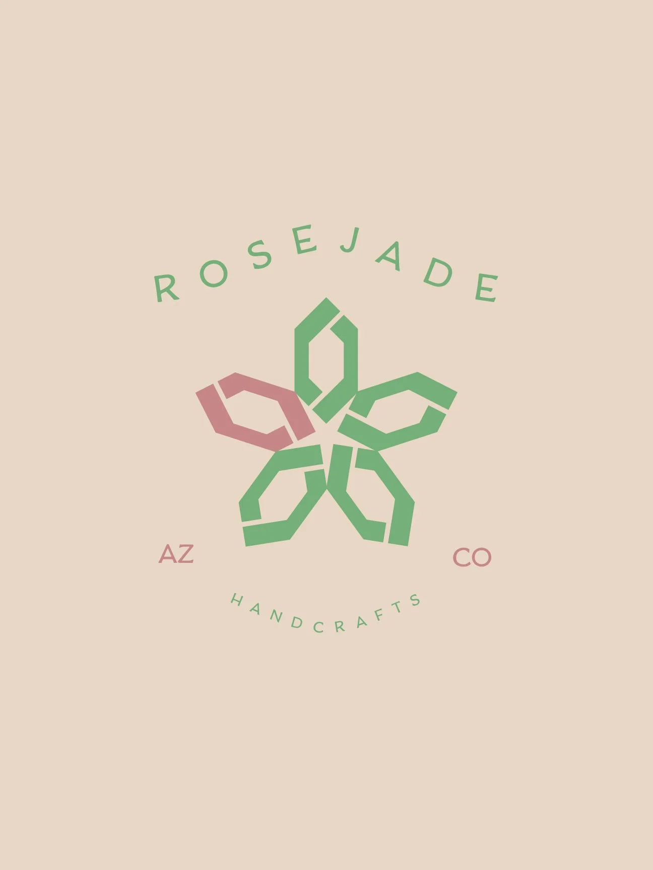
Working from a focused creative brief, I developed an iterative logo exploration that balanced the warmth of handmade craftsmanship with a refined visual sophistication. The concepts ranged from stripped-back minimalism to more layered, intricate mark-making — all unified by a naturalistic, restrained color palette with subtle tonal depth that felt organic to the brand's ethos.
Typographic selection was intentional and considered. The primary typeface carries an approachable, human quality — lending the brand a sense of warmth and accessibility. A carefully chosen secondary typeface provides contrast, grounding the hierarchy with strong readability and visual balance.
The resulting brand system was rolled out holistically across the full customer touchpoint experience — from packaging and product development to advertising collateral — creating a cohesive and elevated brand presence.