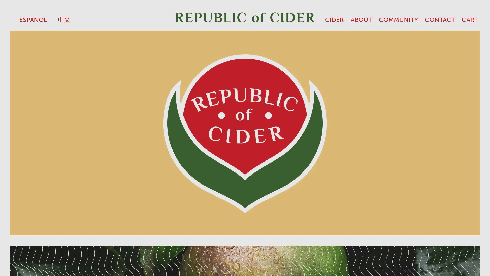
Republic of Cider is a Seattle-area cider company committed to crafting excellent products while investing in the communities they call home. Rooted in diverse ethnic communities, they partner with local charities and organizations to drive meaningful impact — growing both their brand and the causes they care about.
Their existing branding, however, tells a different story. Tired, generic, and overly complex, it fails to reflect the company's character, values, or community-driven mission — leaving a brand with real heart looking and feeling rather underdeveloped.
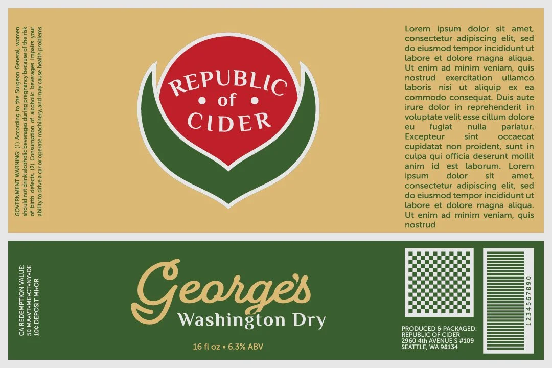
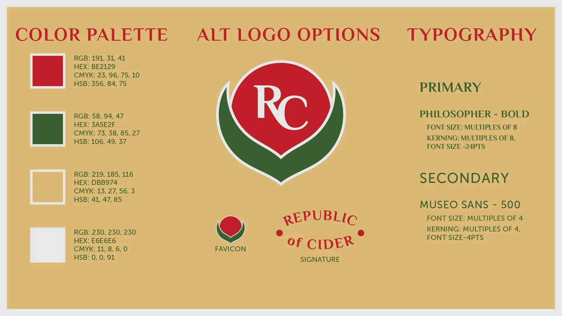
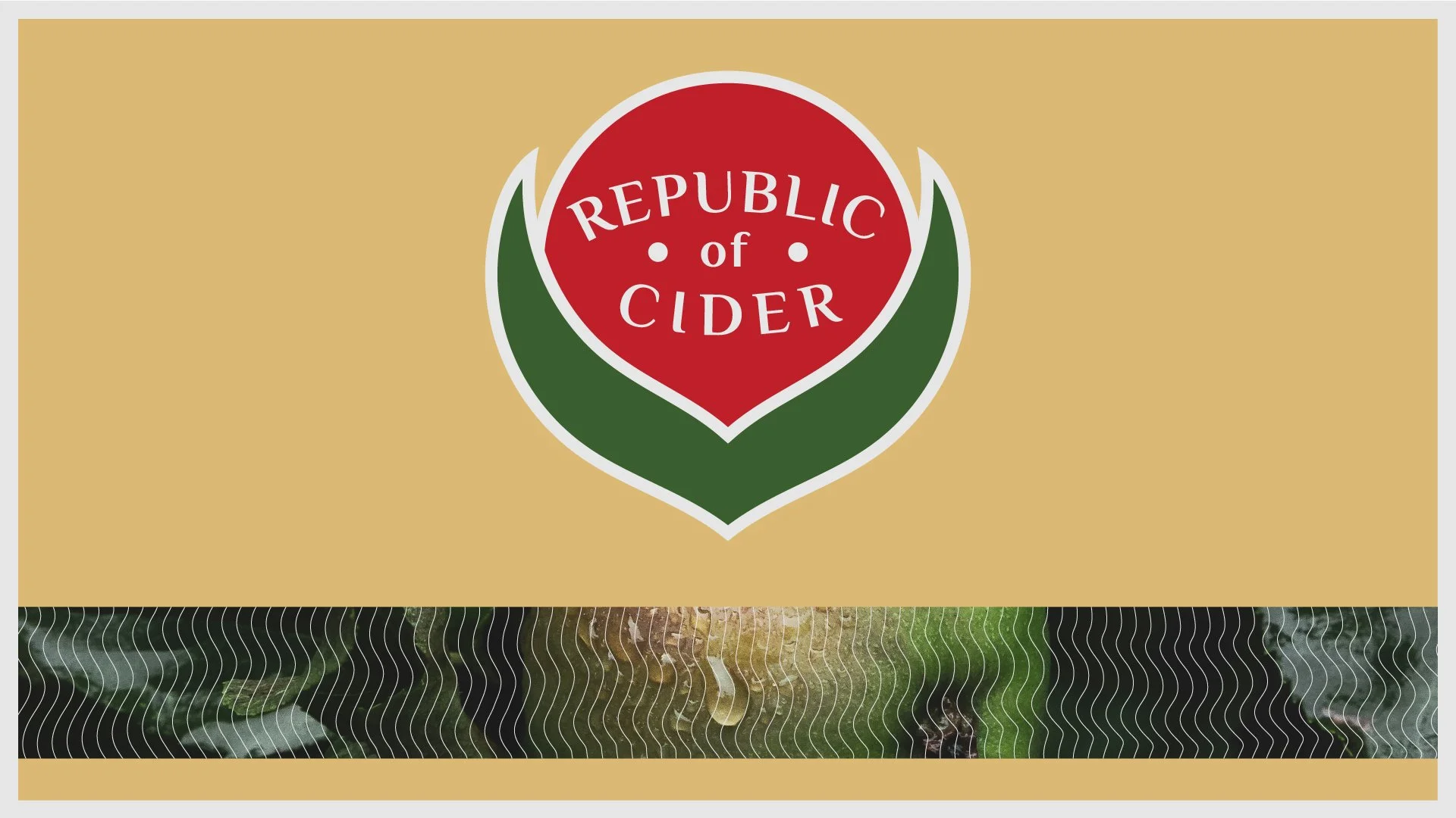
What follows is a theoretical rebrand concept for Republic of Cider. Following established large-scale branding methodology adapted into a focused presentation format, this concept reframes the brand around three core principles: approachability, community, and professionalism.
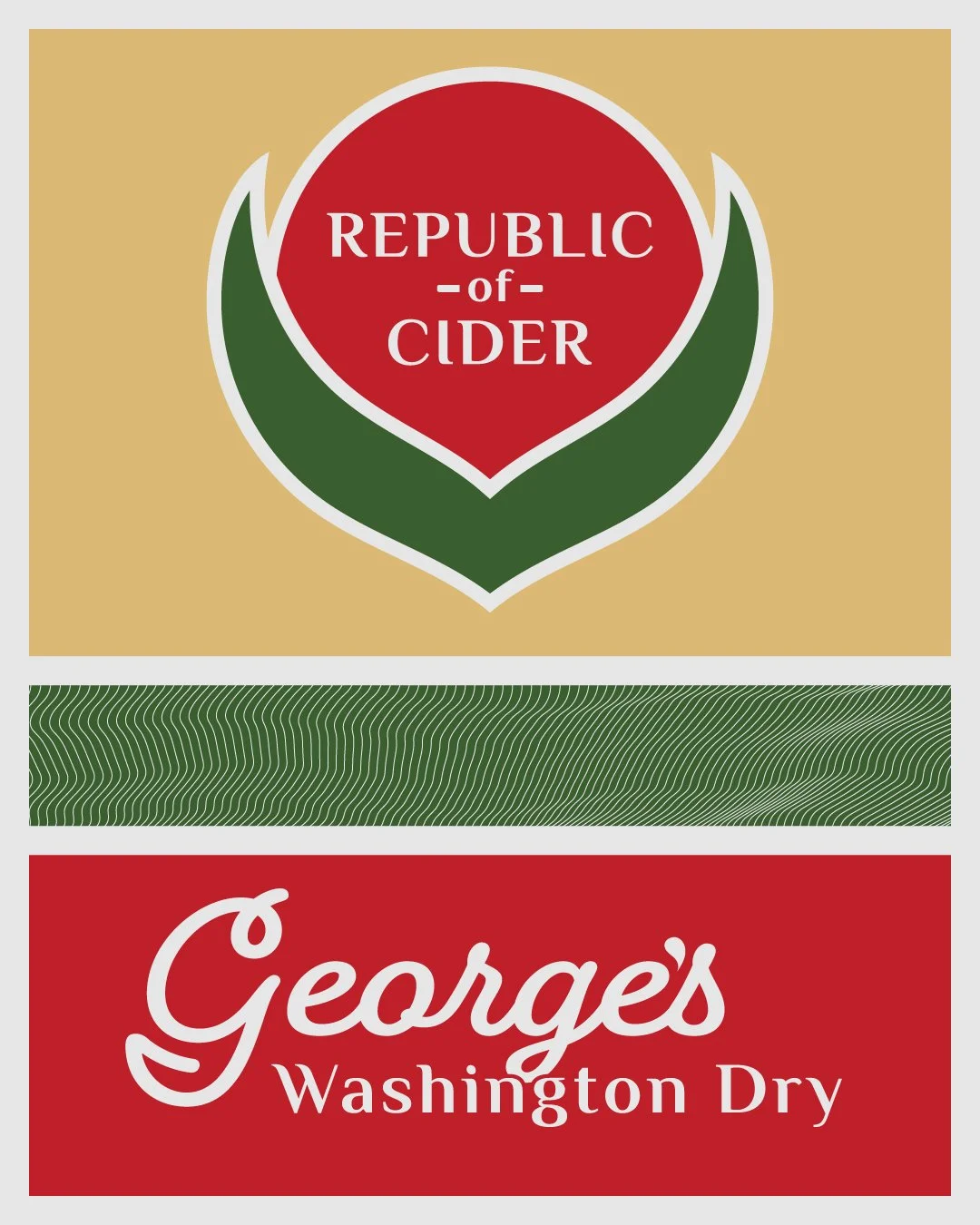
The new identity draws inspiration from the humble fruit sticker — those small, iconic labels found on everyday produce — reimagined as a design system that weaves together Mexican and Taiwanese cultural elements. The result is a brand that feels polished yet grounded, clean with a deliberate rustic edge.