

Dejima Coffee
Dejima Coffee is a Seattle-based specialty roaster focused on small-batch production and custom roasting. Their mission is straightforward: put the customer in control of how their coffee is sourced, roasted, and experienced.
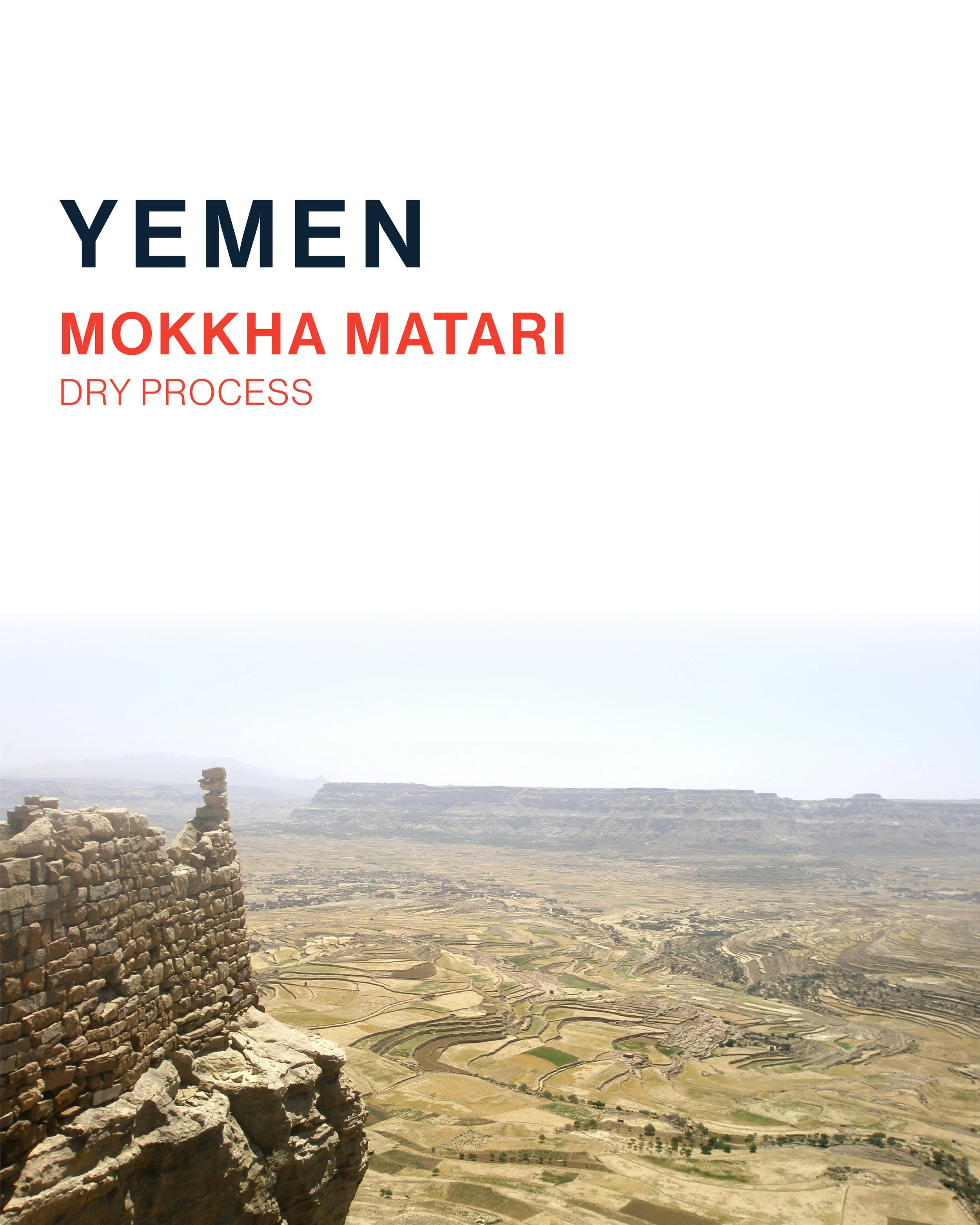
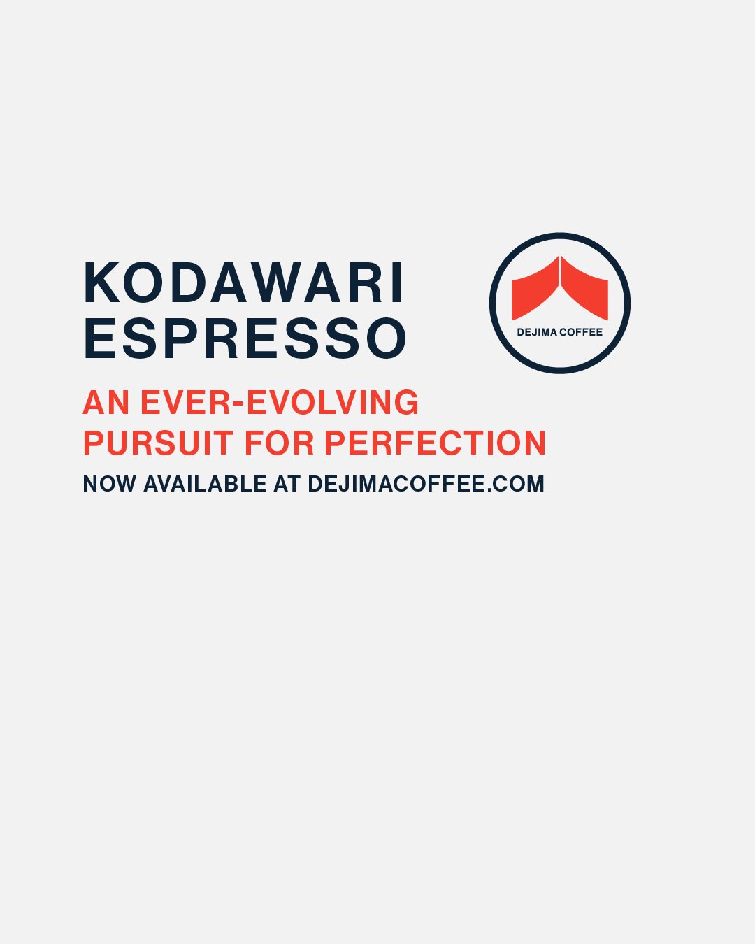
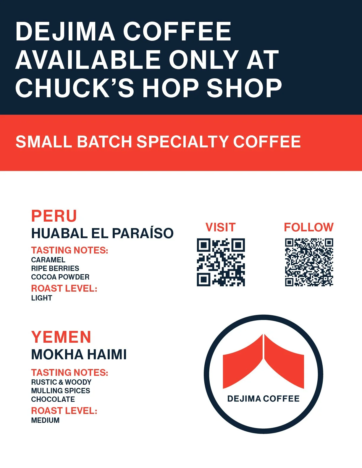
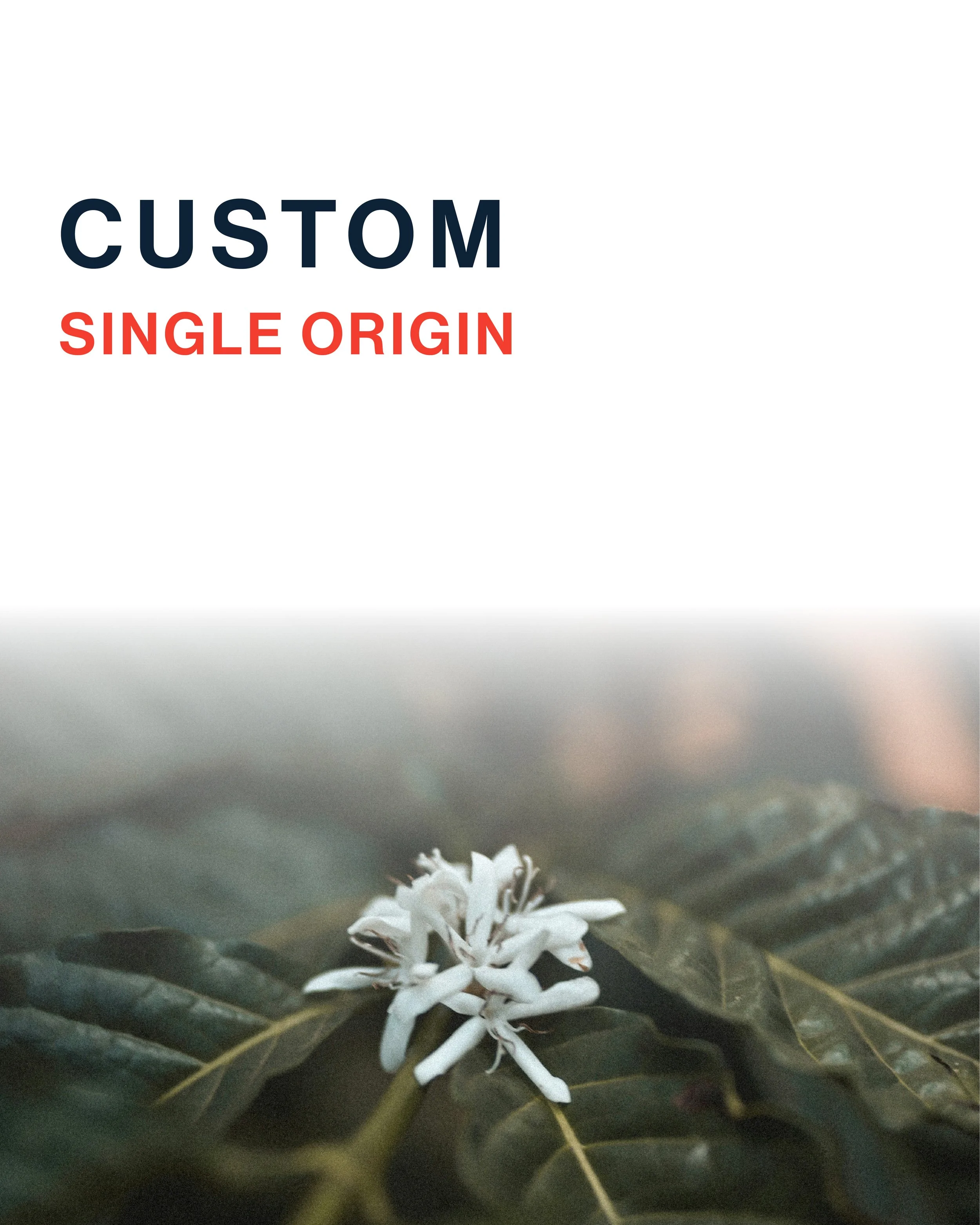
The visual identity system spans both print and digital touchpoints, each crafted to reflect the brand's refined minimalist aesthetic. Drawing from the Japanese design principles of patience, precision, and intentionality, the brief called for something simple, clean, and bold without sacrificing market relevance.
The result is a cohesive brand system that balances sleek, contemporary typography and layout with the core tenets of Japanese design philosophy: simplicity, purposefulness, and legibility.


Process
I took the client brief through a clear process: research, development, testing, and implementation. The client wanted a streamlined, minimalist aesthetic with subtle textural accents, informed by Japanese design and true to the company's ethos: simple, clean, and adaptable. Restraint and negative space became the foundation of the look.
With that direction set, I built a concept board early and kept the client informed at every major decision. After consulting other designers, I landed on a concept that was bold yet approachable.
Presenting the initial concepts sparked a round of iteration that pushed the design toward an even more minimalist expression, with negative space doing more of the work. Phrases like "utilitarian" and "universally adaptable" became my guiding principles.
After several rounds of refinement, I moved into production, building assets for packaging and social media. Adaptability sits at the core of the system, so I delivered a set of foundational designs the client can update quickly for new products.
The client hasn't launched a full rollout yet, but the work so far has been received positively.